As an exercise, I created a mockup of a book cover. It was an interesting learning process that allows me to demonstrate how my work would translate into a final product. On this page, I would like to take you through the process.
Step 1: Sketching
A good sketch is a good start!
Matilda is a true classic. Many people know the story and the characters. For this reason, I have chosen this book! In this way, people will see a version of a story they already know, dressed in my illustration style. Do you recognize the characters?
A good sketch is a good start!
Matilda is a true classic. Many people know the story and the characters. For this reason, I have chosen this book! In this way, people will see a version of a story they already know, dressed in my illustration style. Do you recognize the characters?
The idea is to create a cover that highlights the most important aspects of the story. For me, these are the characters, books, and of course Matilda herself! I also want to convey the magical feeling of her telekinetic powers.
The bonus idea is to form a large 'M' with the book behind her. We will see if this ultimately works out.
The bonus idea is to form a large 'M' with the book behind her. We will see if this ultimately works out.
Step 2: Grayscale
Once I am satisfied with a rough sketch, I move on to working with grayscales.
The grayscales serve as a good foundation for the colors that will follow later. This way, I can already play a lot with the atmosphere and feeling.
I want to depict Matilda as an outsider. Therefore, I place her in a dark corner where she stands out from the background. The characters above her look down on her from behind the book. The intention is for them to be visible but not to take center stage on the cover.
On to the color tests!
Step 3: Colors
Now it's time for a big step. Which colors will I use?
This part of the process always feels a bit overwhelming to me. Fortunately, I already have a bit of an idea about the atmosphere I want to achieve from the previous step. Handy!
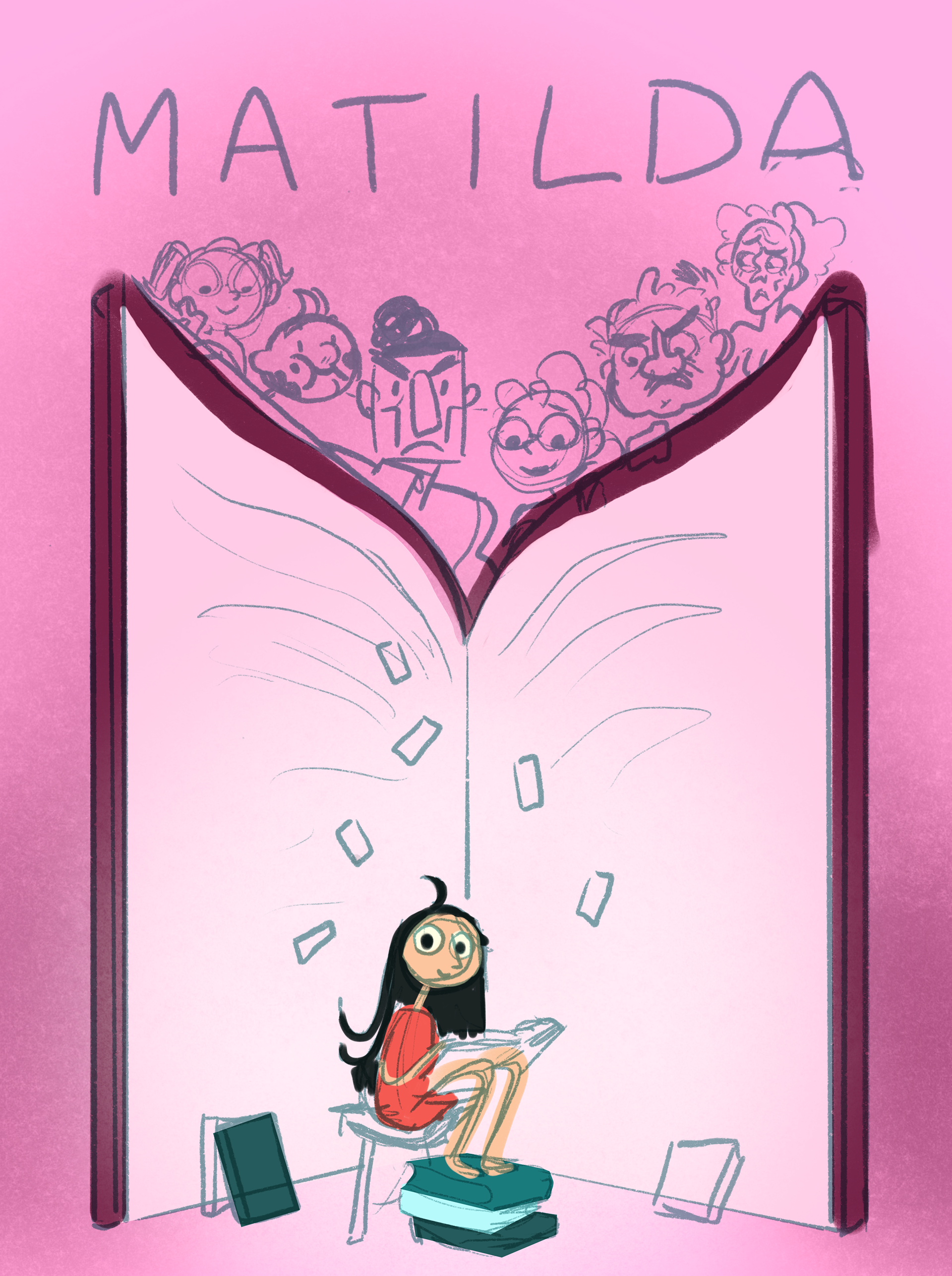
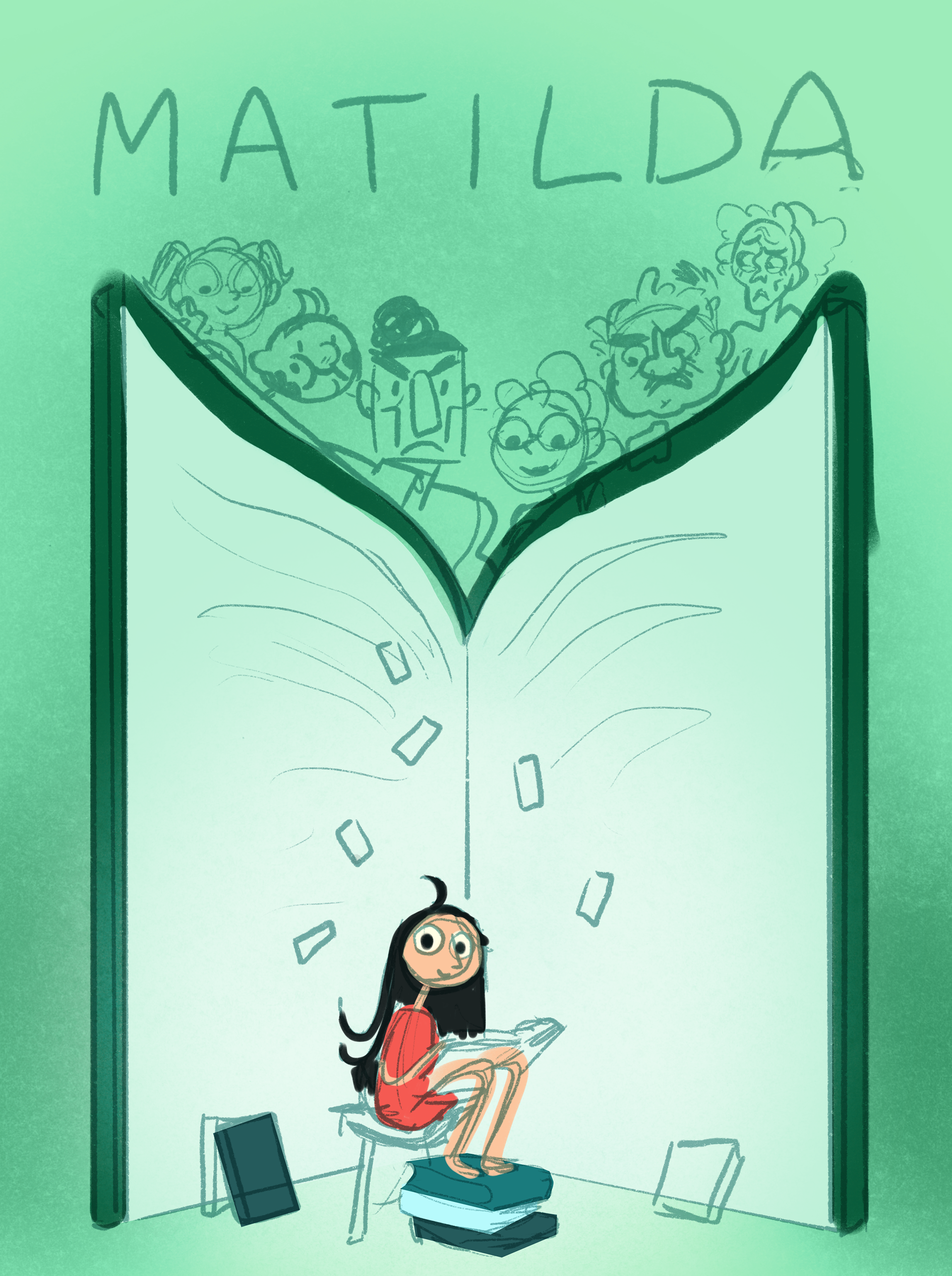
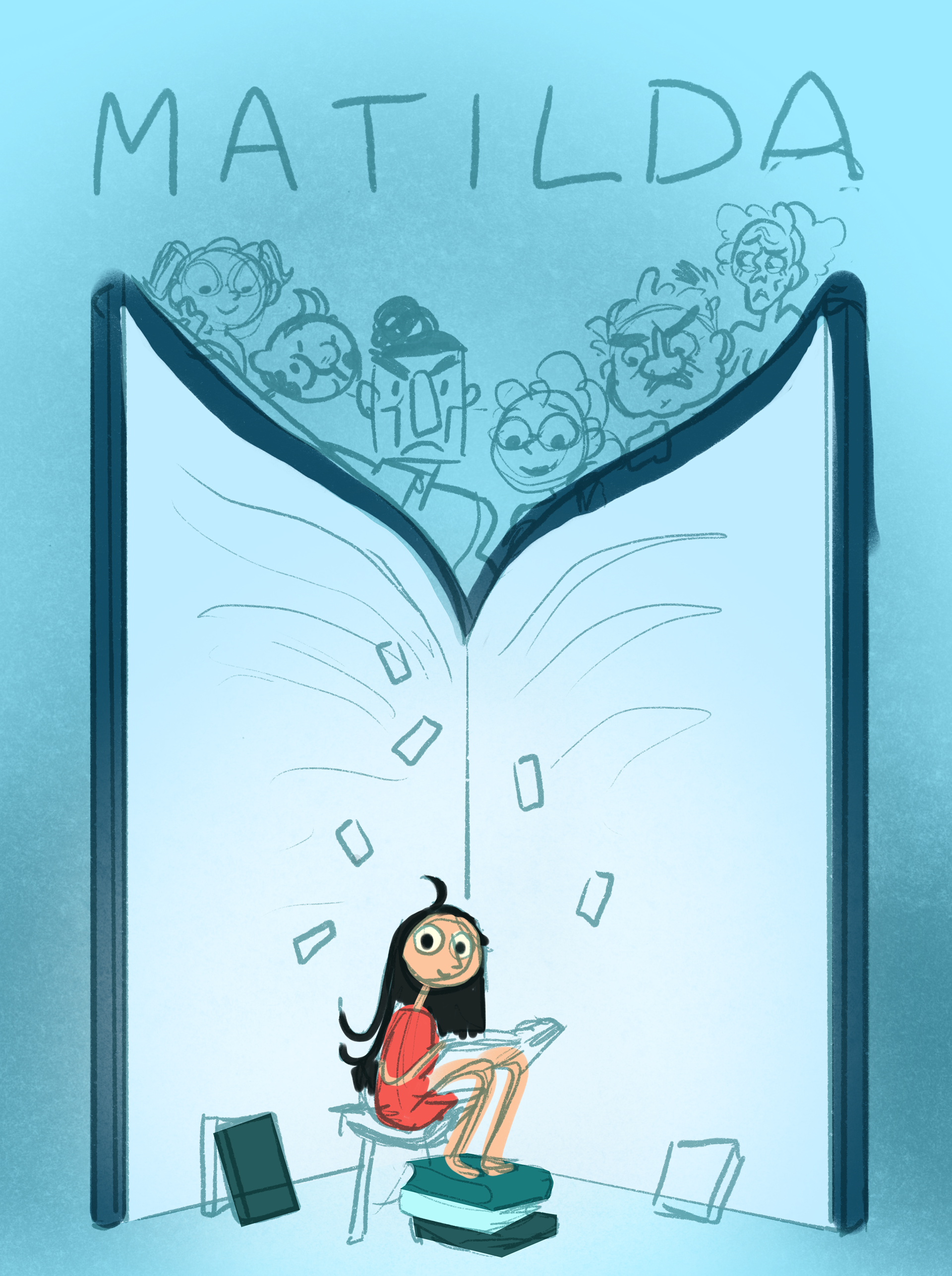
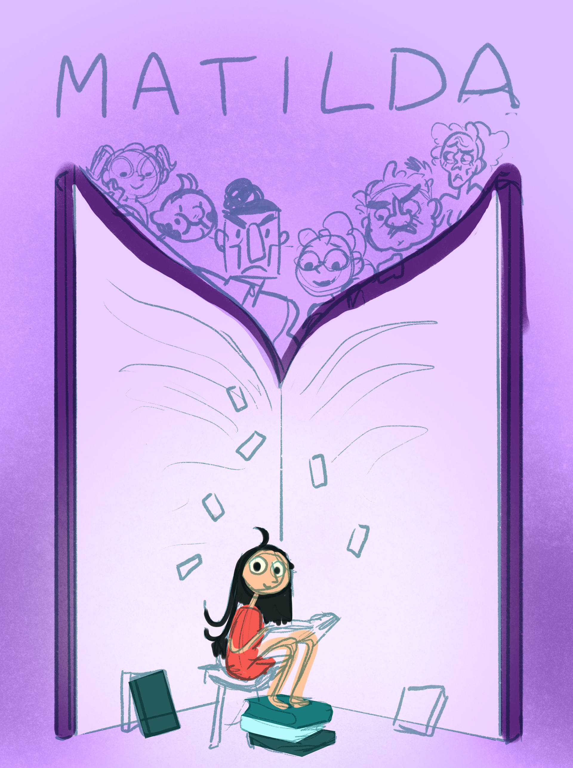
As I mentioned earlier, I want to convey a certain feeling of magic. I also find tension important. When I go through the different options, I notice that I lean towards blue and purple. I find the pink variant too sweet and the green too cheerful.
Which color do you think fits best?
Step 4: Lines
I now have a rough sketch, grayscales, and color tests. Enough sketchy steps, it's time for some details!
I do this, however, only for the parts where details are really important. In this case, those are just the characters and the typography.
For the title, I try out different fonts and eventually settle on the one you see here. A beautiful classic font that doesn't feel too sharp! In my opinion, a suitable choice for the children's story.
For the characters, I choose a brush with a small texture. I also fill in the dark areas with the same brush. This makes the drawing look more traditional while still being a digital drawing.
Step 5: Color!
This is where it gets interesting.
At this stage, I am working on a lot of different things. Ultimately, I opted for a dark combination of dark blue, with color accents of bright pink and a lighter-colored Matilda.
What I am already satisfied with is the title, which I colored in a sketchy manner, and Matilda's colors. I also find the highlighted letters in the book beautiful and am pleased with the paper-like texture I laid over it.
However, I am still struggling a lot with various aspects. For instance, I have the feeling that the book now feels too mysterious for what the story actually is. Also, the characters at the top of the book still feel very flat and sketchy.
Finally, there is one thing that I only noticed very late and really want to adjust. Do you see what I mean?
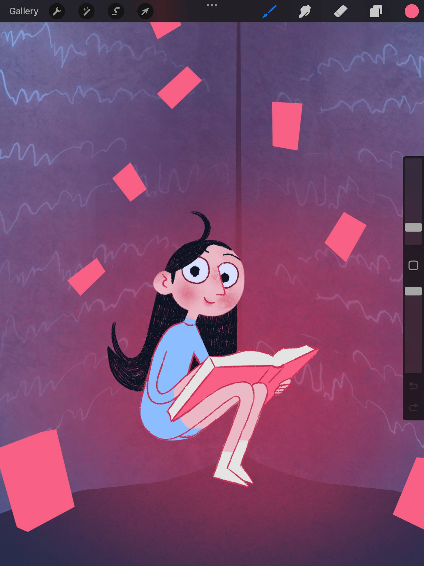
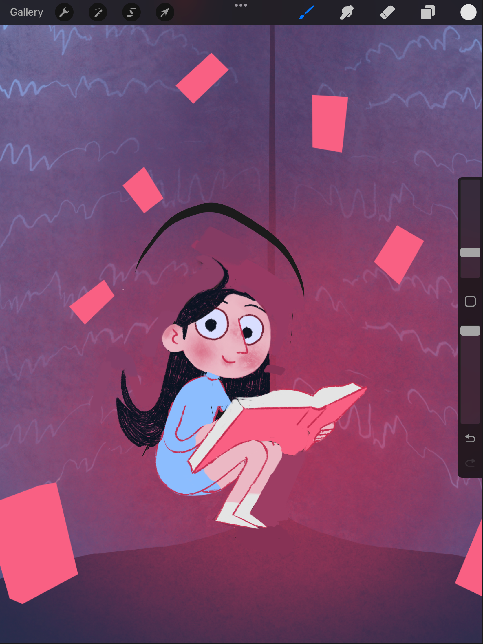
I realized that Matilda in the book is only 6 years old!
In my illustration, she looks much too old. I, of course, also checked this with others, and it turned out that they estimated her to be around 14 years old in my first illustration.
It's a shame I noticed this so late, because now I have to figure it out. In the images on the left, you can see how I can make her look younger with a few small adjustments.
I simply shorten her legs and neck a bit, and she immediately looks younger. Now I just need to adjust the illustration itself neatly.
Step 6: Finishing Touches
The final step!
The final step!
In addition to Matilda herself, I have added a few last details. Now she is sitting on a stool and leaning her feet on a stack of books.
I have also added the flying playing cards around her and around the title, as it seemed a bit empty there.
The characters above the book were still a bit sparse. Therefore, I added some small details and color variations to make them look more finished.
Final thoughts!
This was a significant learning process! It was the first time I made a book cover, so there was a lot that was new. I think I could still puzzle over the design for a long time, but for now, I am satisfied enough.
Next time, I want to keep it simpler. I have added too many elements this time, which wasn't necessarily needed. Additionally, it means there are more elements to consider.